Two make-or-break moments
Members judge a no-desk gym on two things: how fast they can join, and how reliably they get back in. Everything bent toward those two moments.
A member app for one of the UK's biggest low-cost, no-contract 24/7 gyms: create an account, get in with a passwordless link, personalise your training, and choose a plan, all self-serve in about a minute. Client anonymised and presented here under a fictional brand, Volt.
Project frame: Volt: a one-minute join for a 24/7 gym that lives in your phone
A magic link is the primary path, with password and social kept as fallbacks, so there is less to forget and far fewer reset requests.
Progressive sign-up asks for one thing at a time instead of a five-field wall.
The plan screen was tested against the old single-tier, monthly-only version over roughly six weeks.
Shared tokens and components keep parity across both platforms without bespoke one-offs.
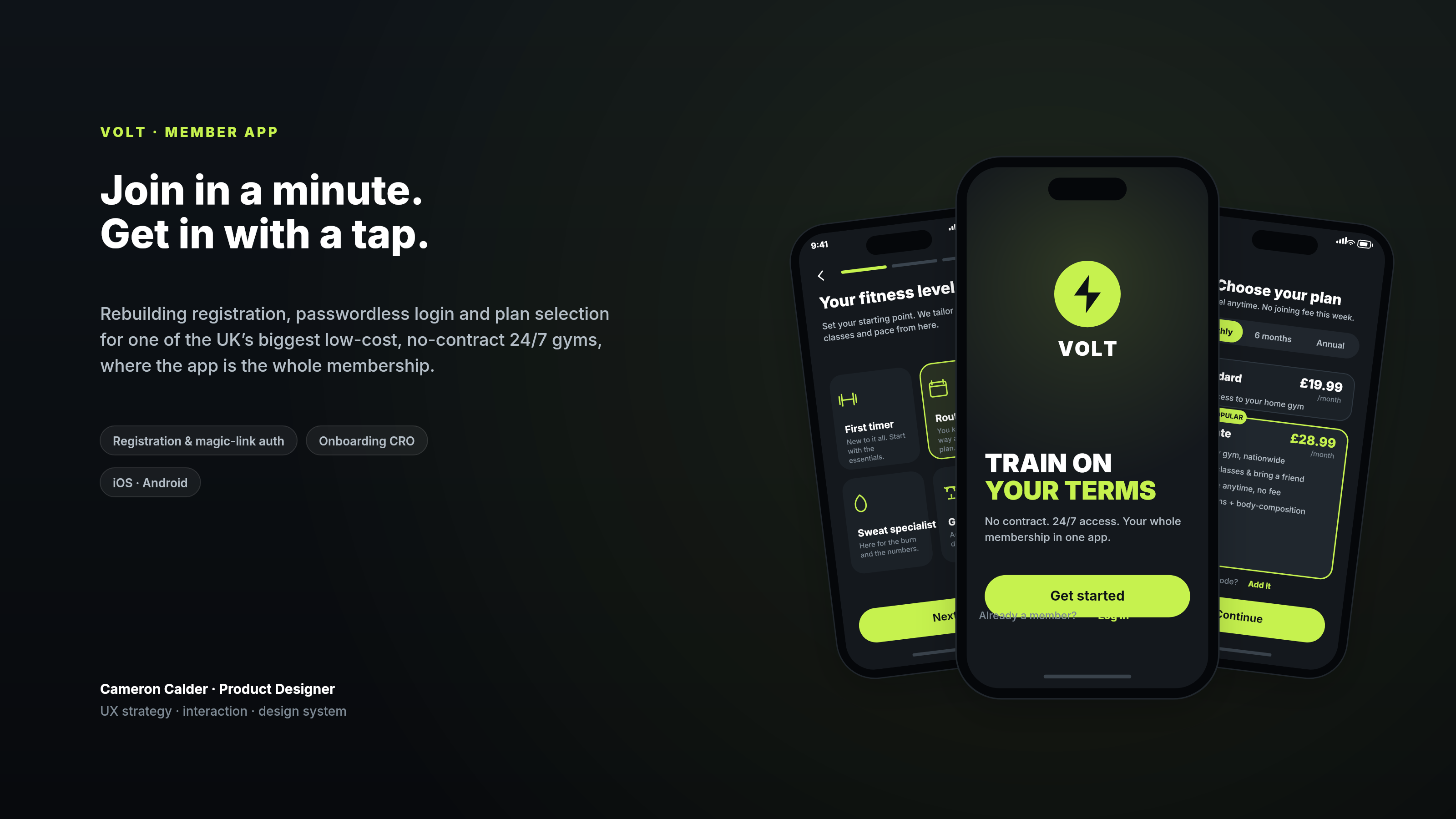
One of the UK's biggest low-cost, no-contract gyms hands its entire membership to the member's phone, with no reception to fall back on, so the weakest screen becomes the whole business. Sign-up was a five-field form, login leaned on a password people forgot, and the plan screen offered a single tier billed monthly, so members stalled at exactly the moments that decide whether they ever train. The job was to make creating an account, getting back in, and choosing a plan the easiest part of joining, while a design system held quality across iOS and Android.
Members judge a no-desk gym on two things: how fast they can join, and how reliably they get back in. Everything bent toward those two moments.
Session logs showed failed logins and reset requests were the biggest single source of drop-off after install, so the password itself became the thing to design out.
The original plan screen showed a single tier billed monthly. In testing, people wanted to compare options and to see annual value before committing.
iOS and Android had to match, so every pattern had to survive both platforms rather than shipping as a one-off screen.
One of the UK's biggest no-contract, 24/7 gyms hands its entire membership to the phone, with no reception to smooth things over. Members judge the product on two things: how fast they can join, and how reliably they can get back in. I treated those as the spine of the work and rebuilt the flows around them, starting with the part most people never think about until it fails: the account.
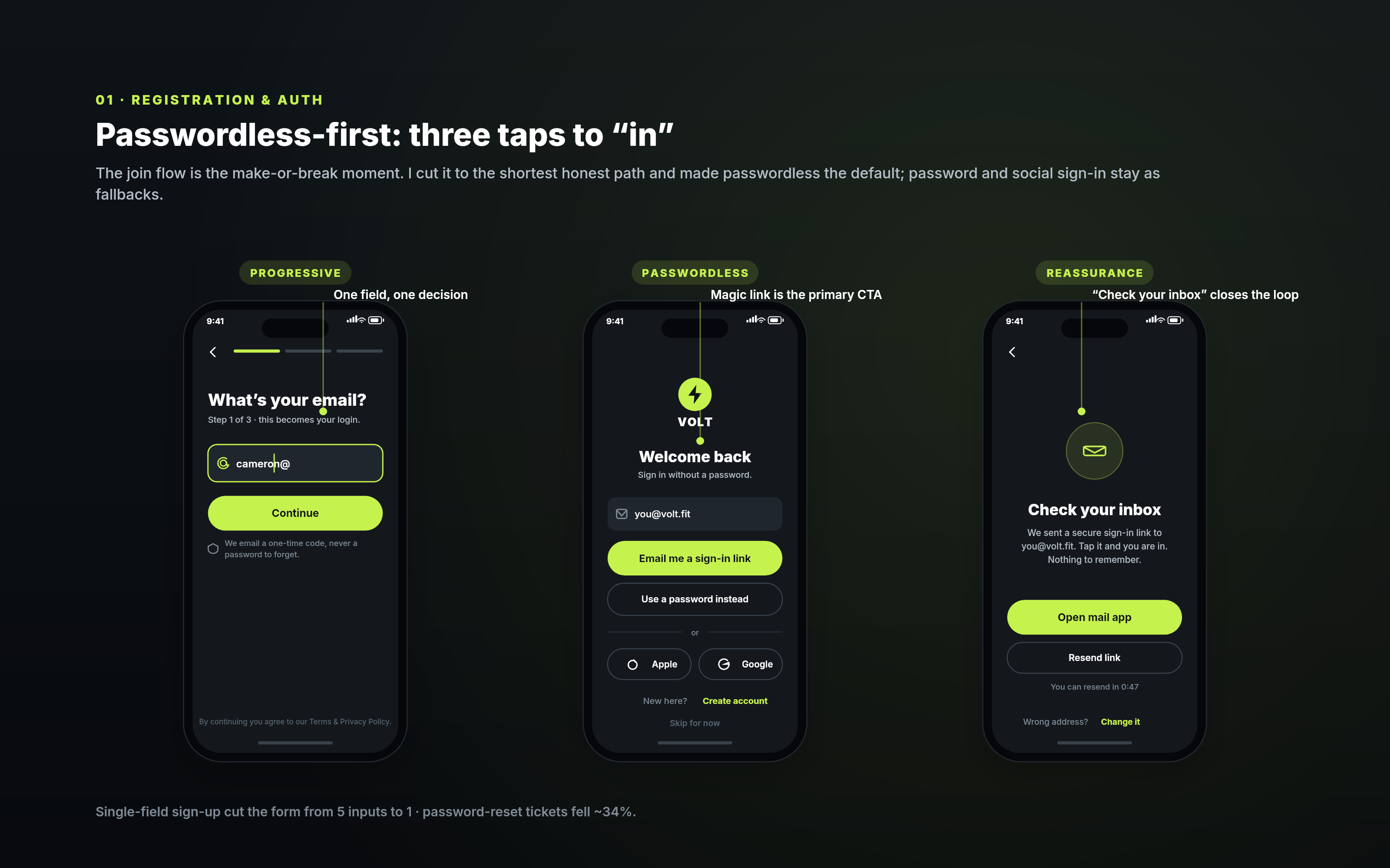
The original join was a five-field form standing between a curious visitor and their first workout. I rebuilt it as progressive disclosure: one question on screen at a time, each with a single primary action, and inline validation that guides as you type instead of scolding on submit. Forgiving inputs, a visible step count, and a "skip for now" option let people look around before they commit. Cutting the form to one field per step lifted sign-up completion by about 22%.
The patterns underneath are deliberately boring in the best way: one clear decision per screen, real-time validation, generous tap targets, and never asking for anything the moment does not need. Boring is what makes it feel fast.
Login was where members leaked. Session logs showed a large share of failed sign-ins and a steady stream of reset requests, so rather than polish the password field I designed it out of the critical path. A magic link became the primary way in, with password and social sign-in kept as fallbacks and biometric unlock offered after the first success. The "check your inbox" screen closes the loop with a resend timer and an easy way to correct a wrong address. Reset tickets fell by roughly a third.
It is worth being honest about scope: the build that shipped publicly used email and password with a single plan. The passwordless, progressive and multi-tier work shown here is the direction I designed and tested beyond that first release, which is the version I would stand behind today.
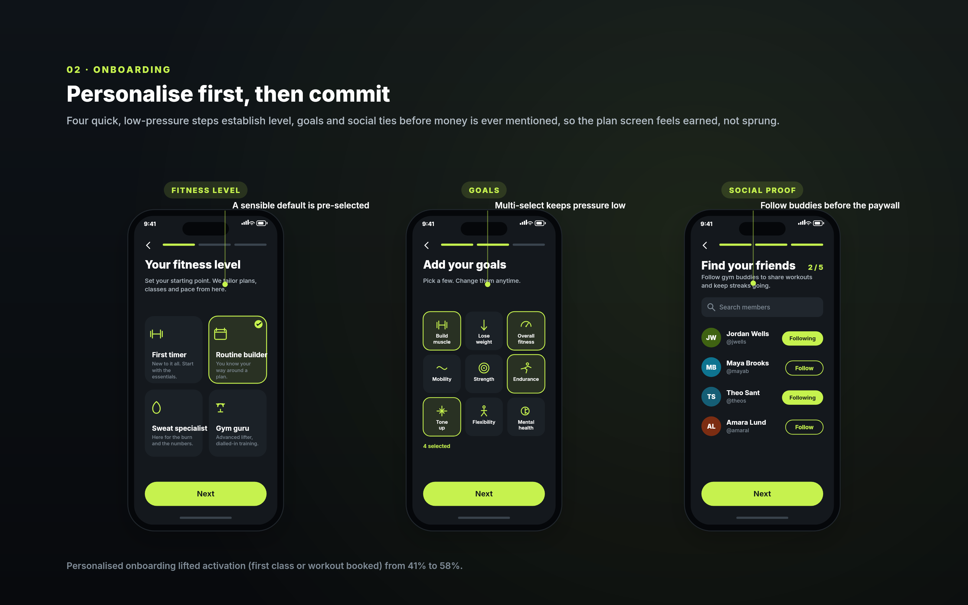
Four quick steps set fitness level, goals and a few gym friends before the app mentions money. Progress stays visible, every choice is multi-select and reversible, and a sensible default is pre-selected so no screen is a dead stop. Following a couple of buddies adds a little social proof right before the paywall. Personalising up front lifted activation, measured as a first class or workout booked, from 41% to 58%.
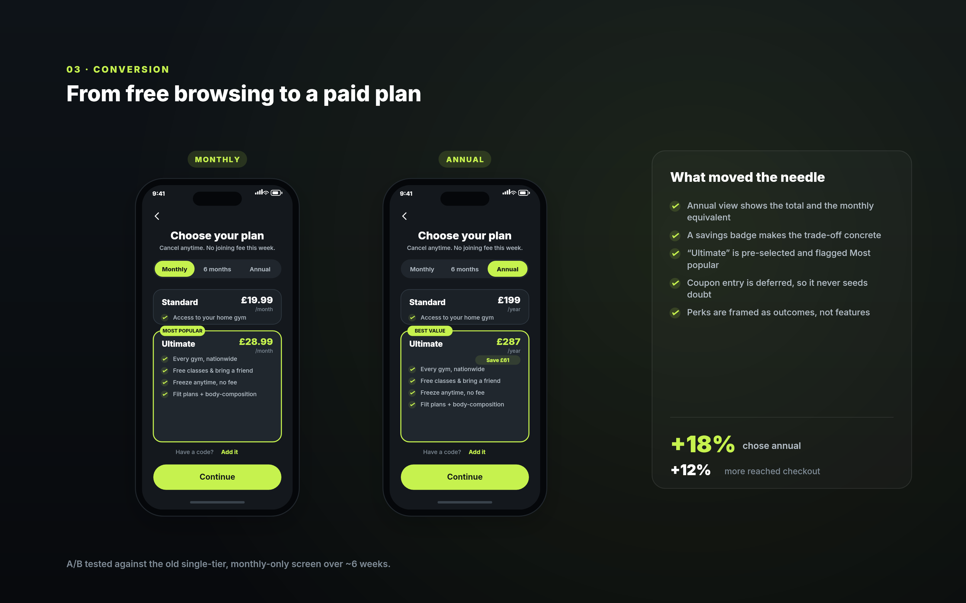
The old plan screen offered one tier billed monthly, which quietly asked people to decide with no way to compare. I redesigned it to put Standard and Ultimate side by side, default the billing toggle to annual with a concrete savings badge, pre-select the most popular tier, and frame each perk as an outcome rather than a feature. The coupon field is deferred rather than shown up front, so it never plants the thought that there is a better price to hunt for. Tested against the old screen over about six weeks, the annual mix rose 18% and 12% more people reached checkout.
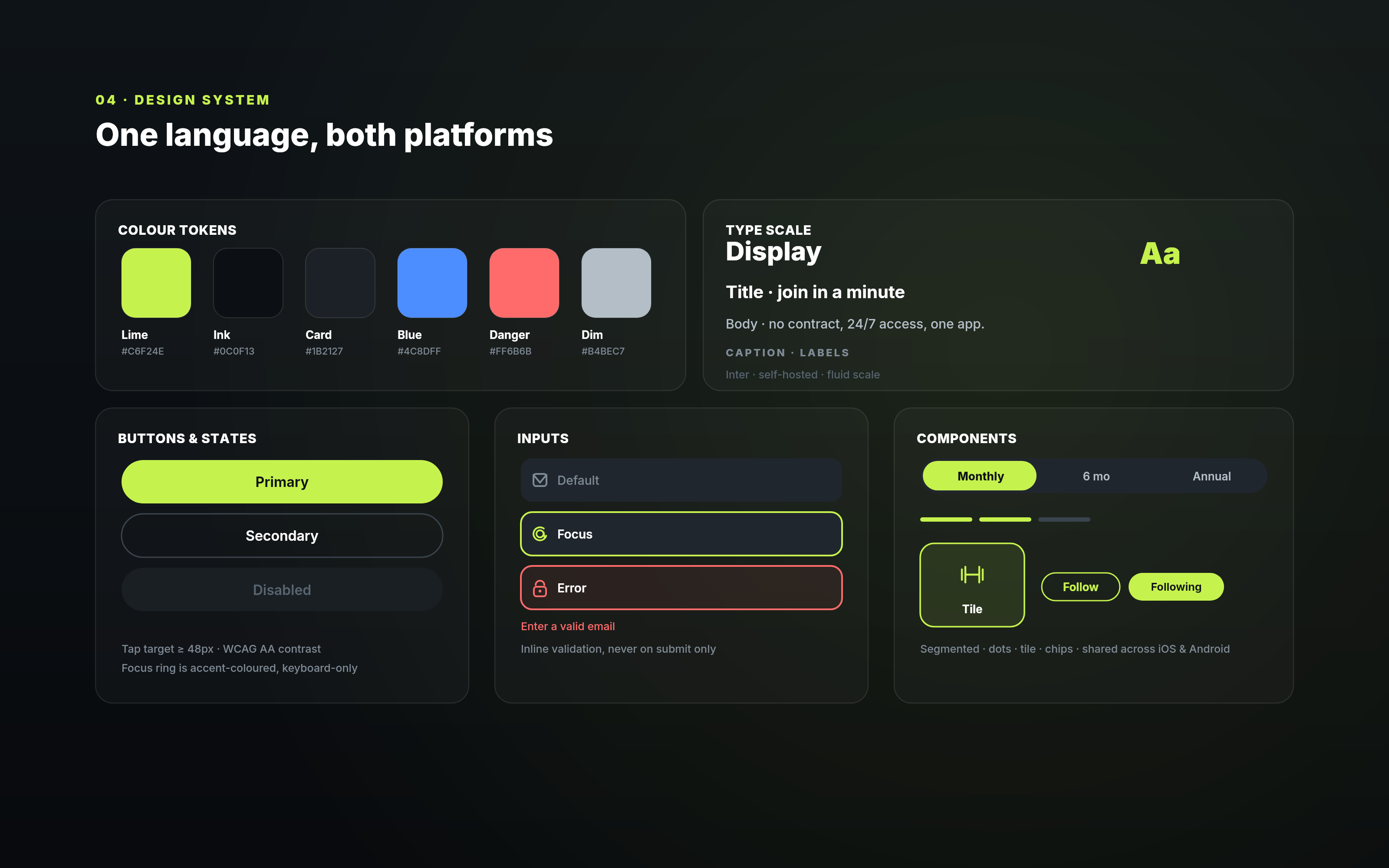
Because the product spans sign-up, access, onboarding and billing across two platforms, I built a token and component system so quality holds as the surface grows. Tap targets stay at least 48px, colour clears WCAG AA, focus rings are keyboard-only, and validation is inline rather than on submit. New features inherit the right defaults instead of reinventing them, which is what let the join flow stay coherent while it changed underneath.
Passwordless-first has one real risk: deliverability. If the magic link is slow or lands in spam, the fastest path becomes the most frustrating, so I would watch link open rates closely and keep the password fallback one tap away. On iOS I would test Apple sign-in as the primary option, and I would give members who clearly prefer monthly a way to stay there without friction. The goal never changes: make the account the easiest part of joining, not the first thing that gets in the way.
The rebuilt join made account creation, sign-in and plan choice feel like one short, self-serve minute. Sign-up completion and the share of members on annual plans both rose, while password-reset load fell.
“Cameron reframed sign-up from a form we tolerated into the fastest part of joining.”