An AI-enabled system from 4,000+ values
I created QZee One as QZee's shared design contract, including human and machine workflows, accessibility evidence, release controls and legacy migration.
- Role
- Co-founder & Product Design Lead
- Team
- Co-founder · Product engineering · AI-assisted implementation
- Year
- 2025
- Platform
- Web · React Native · Email · Marketing · AI agents
- Outcome
- 96.8%required channel parity
- Verified scale
- 4,000+hardcoded values audited
- Deliverable
- 56governed assets
- Scope
- 94contrast pair gates
Evidence note: Figures come from reviewed QZee One outputs; Storybook accessibility applied only to the displayed story, with manual evidence still required for Stable promotion.
On this page
The problem
QZee had grown through multiple products and channels before it had one design contract. Audited codebases contained more than 4,000 hardcoded colour values, while two brand limes, four type scales, and incompatible slot palettes were live at the same time. Creating another component library would only centralise part of that problem. I needed a system that could express shared product intent across platforms, guide the migration of older products, and give both people and AI enough governed context to contribute without creating a new form of drift.
Decisions and delivery
QZee One began as a zero-to-one system, but the products it needed to support already existed. The audit exposed more than visual inconsistency. Two versions of the brand lime were live, typography had split into four scales, scheduling surfaces used incompatible slot palettes, and more than 4,000 colour values had been hardcoded across the reviewed codebases.
Those symptoms pointed to a missing product contract. If I began by drawing a large component inventory, I would reproduce the same decisions in a more central place. I began with the roles the products needed to express: page and card surfaces, primary and secondary text, status, focus, action, time-slot state, tenant accent, motion, spacing, and hierarchy.
I structured the token model in three layers. Core values contain the raw ingredients. Semantic tokens describe intent. Domain tokens add meaning for specialised product states such as booking slots. Products consume the semantic and approved domain layers; they do not reach back into a core colour ramp.
The contract then emits the form each channel needs: CSS custom properties and typed modules for web, theme objects for React Native, constrained rendering rules for email, and reusable compositions for marketing. The goal was not to force identical pixels across every touchpoint. It was to preserve the same meaning while letting each platform behave natively.
Human interface
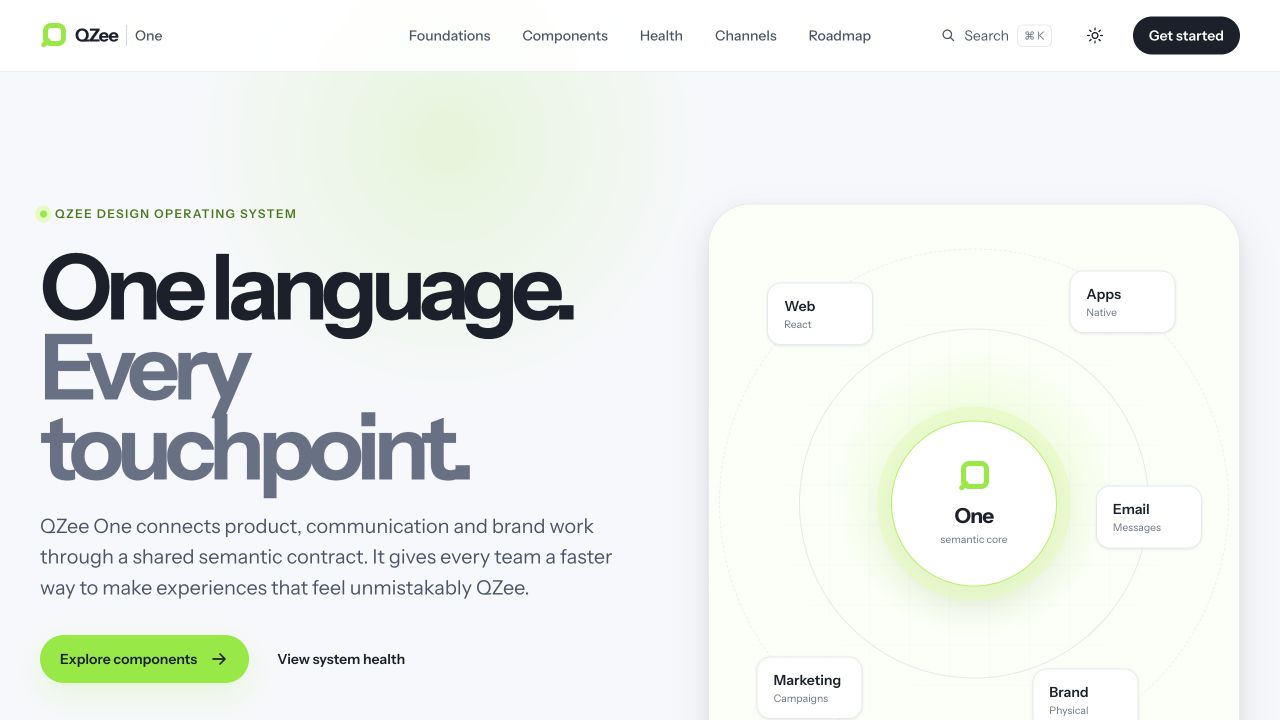
QZee One
Foundations, health and adoption
Storybook
Components, states and guidance
Contribution intake
Problems, evidence and ownership
Shared contract
Semantic tokens, policies and asset records
Core → semantic → domain. Products consume roles, not raw values.
Machine interface
Registry
Lifecycle, channels and evidence
Read-only CLI
Search, inspect and diagnose
Generated health
Deterministic JSON and reports
Third-party branding was not a palette swap. A partner could supply any valid sRGB primary, including a pale yellow, a deep blue, or a mid-tone pink. Applying that value directly to buttons, links, selected states, text, and focus rings would make the same brand readable in one context and fail in another.
I treated the supplied colour as source material. At runtime, QZee One reads the active page and card surfaces, then derives eight semantic roles: accent fill, pressed fill, control boundary, soft wash, soft border, on-fill text, on-soft text, and link. Content on the main fill resolves to dark ink or white, whichever clears 4.5:1. Brand-coloured text is adjusted until it clears 4.5:1 against its surface, while non-text control boundaries clear 3:1.
- 01
Partner input
One valid brand colour
- 02
Read context
Current page and card surfaces
- 03
Derive roles
Eight accessible theme values
- 04
Apply safely
Components consume intent
Yellow
Input #FFCC00
On-fill text: Dark ink
Pressed
#e0b400
Soft state
Selected
Blue
Input #0057FF
On-fill text: White
Pressed
#004de0
Soft state
Selected
Pink
Input #FF2D8D
On-fill text: Dark ink
Pressed
#ff469b
Soft state
Selected
Allowed to flex
Fill, pressed, boundary, soft wash, soft border, on-fill text, on-soft text and link
Text roles clear 4.5:1. Control boundaries clear 3:1 against both the page and card surfaces.
Protected from branding
Focus stays fixed blue. Surfaces, status and structural text stay system-owned.
The allow-list was as important as the derivation. Partner branding can change the accent role set, but it cannot change page and card structure, status meaning, primary text, or the focus ring. Focus stays a fixed high-contrast blue, preventing a pale partner colour from making keyboard position invisible. When the theme changes, the tenant roles are re-derived against the new surfaces rather than carrying light-theme assumptions into dark mode.
The AI-enabled layer was not a prompt that generated arbitrary interface code. I treated AI as another system consumer. To contribute safely, it needed to know which asset was approved, where it could be used, who owned it, what lifecycle it was in, which channels it supported, what evidence existed, and where the known gaps were.
The registry makes those facts machine-readable. Generated JSON exposes health without creating a second hand-edited truth, while the zero-runtime-dependency CLI can search by task intent, inspect a component or channel, find documentation, report system health, and diagnose a consumer's declared package exports. Search is deliberately deterministic lexical ranking rather than an unverifiable remote model.
01
Product issue
Evidence and allowed paths
02
Human triage
Agent-ready only after review
03
Read-only discovery
CLI, registry and health
04
Draft change
One scoped task and early PR
05
Quality gate
CI plus accountable review
Human authority stays explicit
Current safety boundary
Agent-authored draft publication remains disabled until branch protection can enforce the boundary. Release automation is signal-only and never edits a consumer repository.
This is constrained autonomy. A product issue must be human-triaged before it can become agent-ready. Scope and allowed paths must be explicit, and the agent must stop if human work overlaps. Prioritisation, lifecycle promotion, merge, secrets, and deployment remain outside its authority. The architecture enables AI contribution without confusing speed with approval.
QZee One was the front door for foundations, channels, system health, and adoption. Storybook was the focused workshop for the web component contract. Stories sit with their components, use the same semantic roles, switch between light and dark schemes, expose typed controls, and generate reference documentation from the public API.
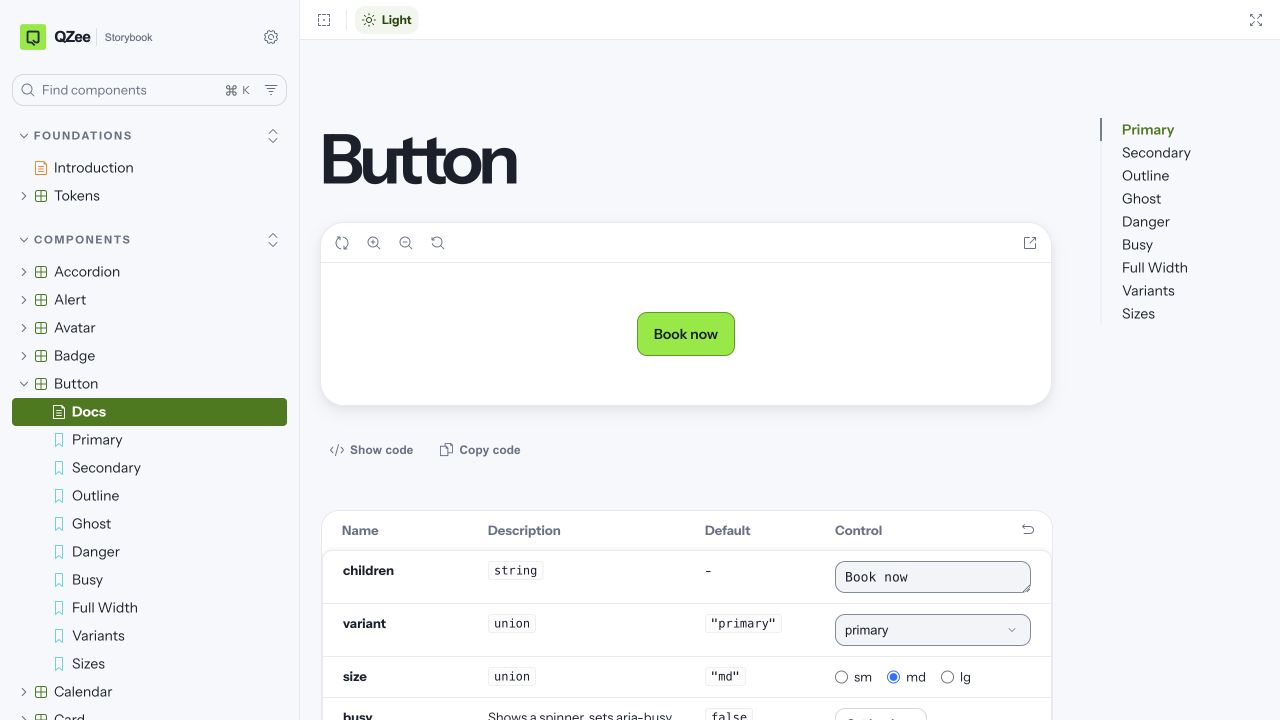
I kept the distinction between demonstration and governance clear. Storybook shows the component contract and gives authors rapid feedback. Tests govern behaviour, and the registry records lifecycle, channel support, evidence, and ownership.
The submission flow starts in the repository that owns the product problem. The proposer must describe the need, identify the existing token, component, pattern, or template they considered, and explain why it is insufficient. They also name the affected channels, expected consumers and paths, acceptance evidence, and whether the work could later be prepared for an agent.
- 01
Frame the problem
Describe the user or team need in the product repository.
- 02
Check the contract
Show why an existing token, component or pattern is insufficient.
- 03
Define scope
Name channels, consumers, ownership, paths and acceptance evidence.
- 04
Build in context
Cover themes, tenant safety, interaction states and Storybook.
- 05
Record evidence
Add behaviour, accessibility and registry evidence for the target lifecycle.
- 06
Review and release
Pass CI, human conformance review, changeset and migration guidance.
During build, the component contract requires every relevant interaction state, semantic tokens only, both themes, tenant safety, keyboard behaviour, accessible names and states, strict types, tests, Storybook guidance, and a registry record. A published behaviour change also needs a changeset and a migration path. This keeps the system focused on repeated product needs instead of accumulating speculative primitives.
Accessibility starts in the foundations. The token build checks 94 foreground-and-background relationships in light and dark themes against WCAG 2.2 thresholds. It also prevents raw colours, locks light and dark token shapes, keeps a high-contrast focus colour fixed, respects reduced motion, and derives safe foregrounds for tenant accents.
At component level, tests cover roles, accessible names, keyboard paths, focus movement, announcements, disabled and busy states, and native accessibility properties. Representative compositions run structural axe checks, while real browser contracts cover narrow reflow, zoom, visual viewports, safe areas, and nested modal focus.
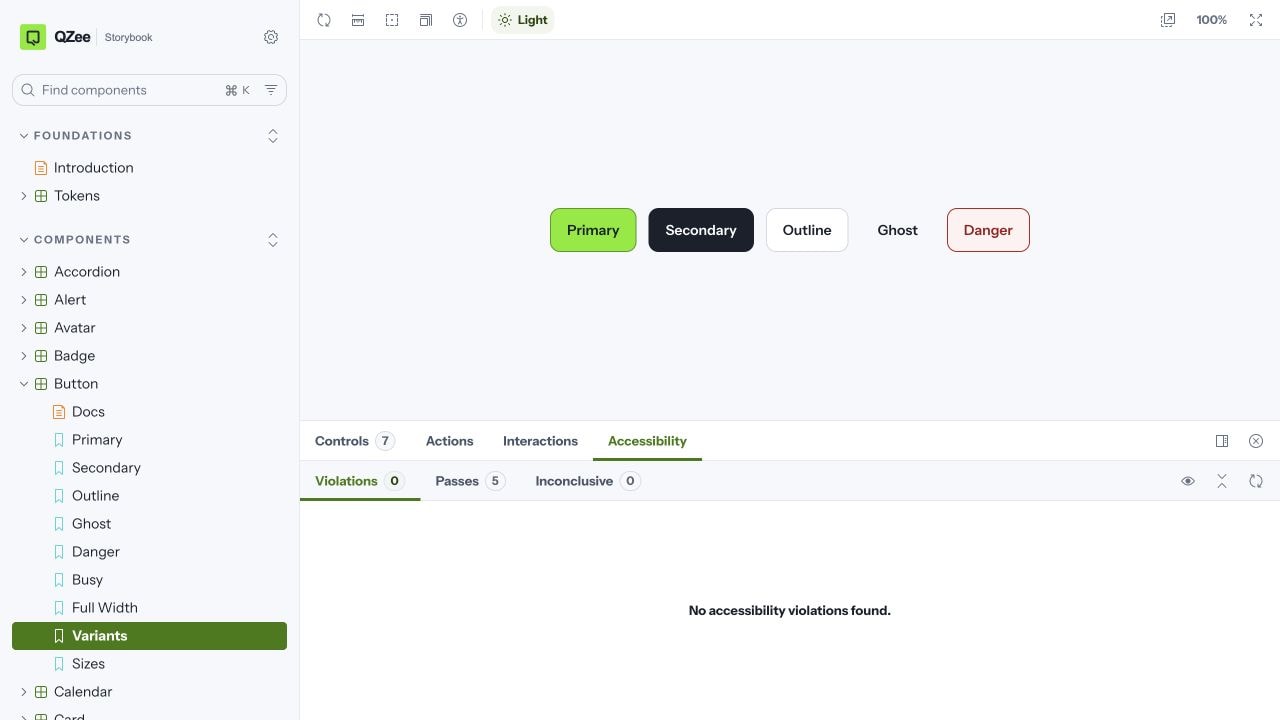
I explicitly did not present automation as certification. Complex assets cannot become Stable without recorded manual keyboard, 200% and 400% zoom, forced-colour, VoiceOver, NVDA, TalkBack, and relevant real-device evidence.
The root pnpm run ci command is the release contract. It validates tokens,
registry data, consumers, CLI behaviour, dependency boundaries, token usage,
changesets, strict types, package output, interaction and coverage tests,
Storybook, the QZee One portal, and deterministic browser contracts in real
Chrome. Pull requests and release automation run the same contract used
locally.
- 1
Foundations
- 94 contrast pairs
- Theme shape lock
- No raw colours
- 2
Component contract
- Strict types
- States and keyboard
- Structural axe
- 3
Real browser
- 320px reflow
- 200% zoom
- Safe areas and focus
- 4
Consumer check
- Locked install
- Version alignment
- design-system:check
- 5
Release
- Changeset
- Package build
- Migration notes
Automation is evidence, not accessibility certification.
Complex Stable assets still require recorded keyboard, 200% and 400% zoom, forced-colour, VoiceOver, NVDA and TalkBack checks.
Each adopting product exposed one design-system:check script and called a
central compatibility workflow. That workflow installs from the product's
lockfile, compares declared, installed, and release-expected package versions,
then runs the fixed check. It cannot accept a caller-supplied command.
Release-triggered version drift can create or update one adoption issue; an
ordinary pull-request failure cannot fill the backlog with duplicates.
The automation mode was intentionally signal-only. It could show that a consumer had fallen behind, but it did not edit that product or open an autonomous change.
Creating the system from scratch did not mean rebuilding every QZee product at once. I treated migration as a sequence of owned journey boundaries. Each legacy surface was audited, mapped from local values and patterns into semantic roles, then moved onto released packages where the contract was understood.
01
Audit
Find raw values, local patterns and incompatible foundations.
02
Map
Translate product intent into semantic roles and shared contracts.
03
Replace
Adopt packages incrementally at an owned journey boundary.
04
Verify
Run the consumer compatibility workflow against the locked product.
05
Track
Turn remaining exceptions into named gaps with owners and evidence.
The compatibility workflow made each step observable. Where a product could not adopt the shared contract yet, the exception became a named gap with scope, ownership, and evidence rather than another silent local pattern. This let the system grow while older products continued to operate.
Component totals are easy to celebrate and easy to misuse. I built the health model to answer harder questions: is the asset supported in every required channel, is the evidence current, who owns the gap, and has the asset genuinely met the bar for its lifecycle?
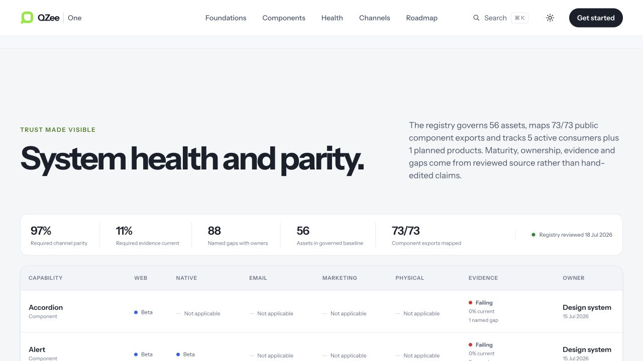
The reviewed snapshot contained 56 governed assets, including 51 components, with 211 of 218 required channel relationships implemented. It also reported only 11.3% of required evidence as current, 88 named gaps, and no Stable asset. That is deliberate honesty: implementation support is not the same as complete manual, visual, localisation, or channel evidence.
QZee One became the shared operating layer behind the broader platform described in the QZee product case study. Its value was not only that it provided components. It gave designers, engineers, products, and AI a common way to understand what existed, what was safe to use, what still needed work, and who was responsible for the next decision.
A governed system that made reach and risk visible
QZee One gave the business one governed contract across web, React Native, email and marketing, with the portal and Storybook serving people while the registry, health report and CLI served automated consumers.
The health model separated implementation coverage from maturity, turning missing manual, visual, localisation and channel evidence into owned work rather than an implied quality claim. These are system-governance outcomes, not claims about commercial growth or accessibility certification.
AI increased the need for governance, not the case for removing it
Making the system legible to software did not mean giving software design authority: deterministic discovery reduced ambiguity, while constrained task intake, human review and release boundaries kept judgement accountable.
Continue the conversation
Working through a similarly complex product decision?
I can help frame the problem, make the trade-offs visible, and carry the decision through to a usable delivery.
Get in touch